RE- DESIGN HARDWARE REQUEST/RETURN FORMS
Heuristic Evaluation
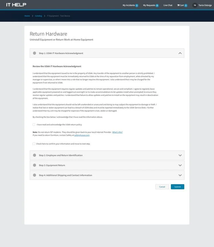
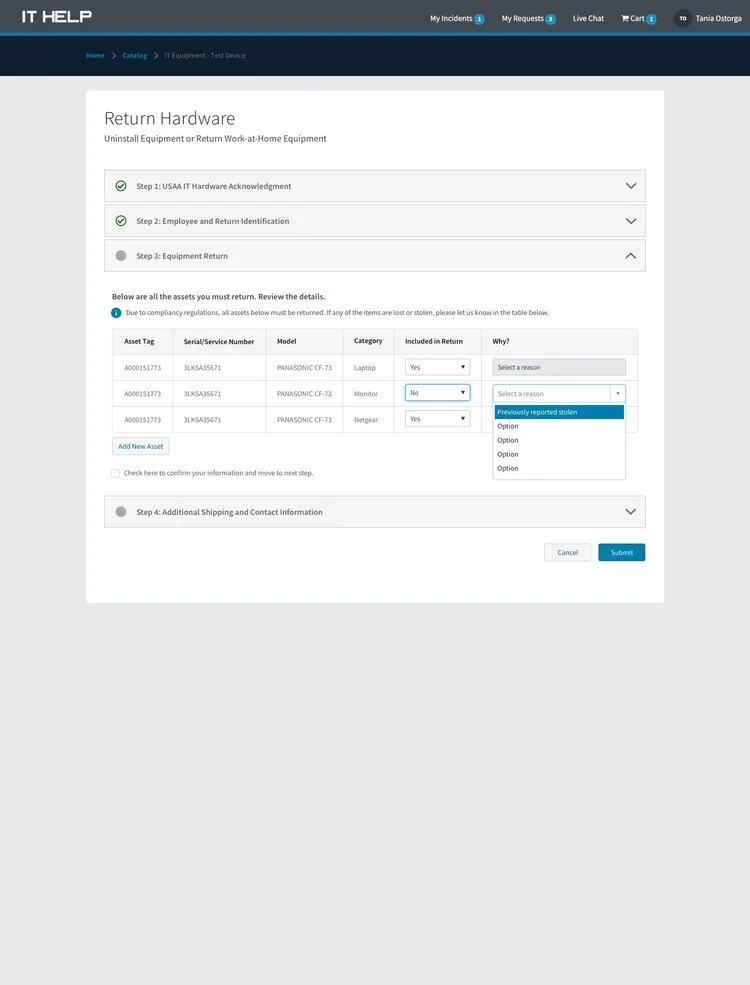
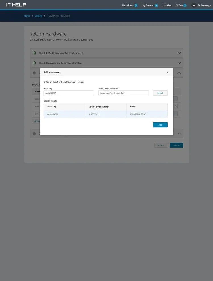
Evaluated existing UI for the IT Equipment - Return Hardware and IT Hardware Acknowledgment form.
I evaluated the forms on: The visibility of system status, match between system and the real world, user control and freedom, consistency and standards, error prevention, recognition rather than recall, flexibility and efficiency of use, aesthetic and minimalist design, help users recognize, diagnose, and recover from errors, and help and documentation.
Scenario 1. Separating from the company
Scenario 2. Return to Office
Scenario 3. Other request
The provided design layouts are focused on an MVP implementation, but may include recommendations that are out of scope for the first build:
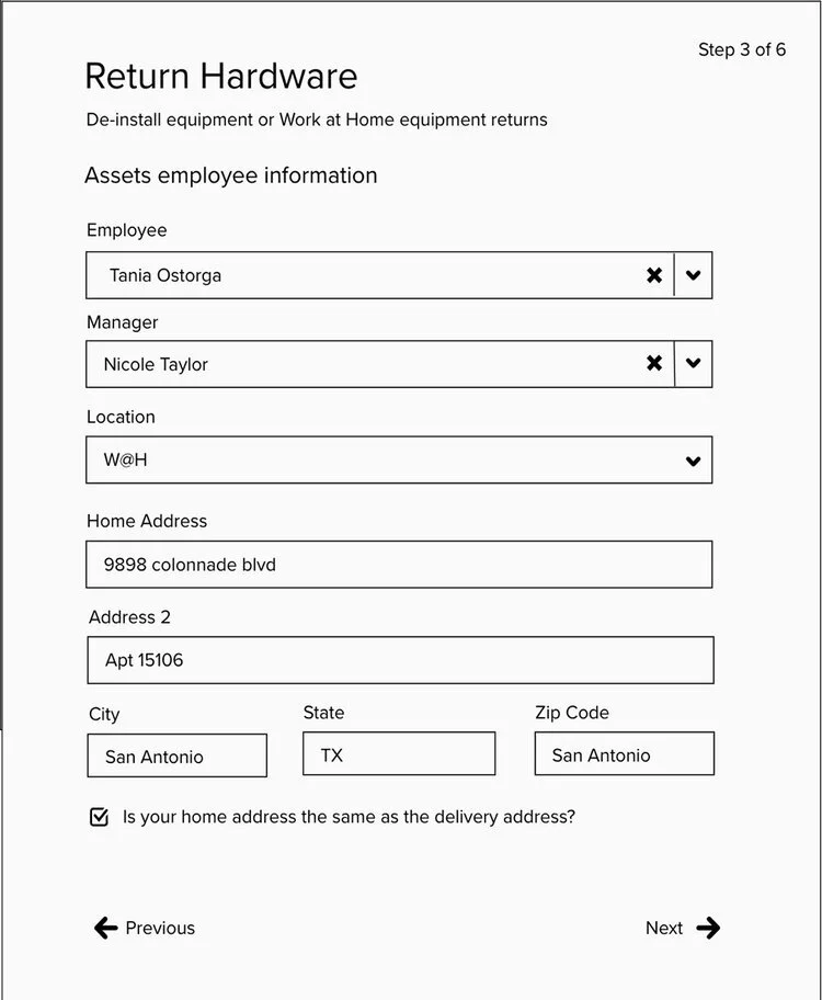
Details: Pre-populate employee details form including location, Dynamic beam location based on building, Beam Location text field auto-fill lookup, Work from Home option in Location field.
Pickup: Dynamic Techspot details based on building
Personalization: Dynamic content based on Manager Role
TESTING RESULTS
Tested Acknowledgment and hardware return pages with 5 different users. The insights sed light of what component were effective and problematic on the forms.
Highlights, key takeaways:
User didn't read the Acknowledgment content so they never clicked on the go/returnhardware
Labels are inconsistent
The purpose of the form wasn't clear
Important instructions were overlooked
There was an overall confusion about the order of the layout
Provided image was confusing
Search button was helpful
TESTING WIREFRAMES
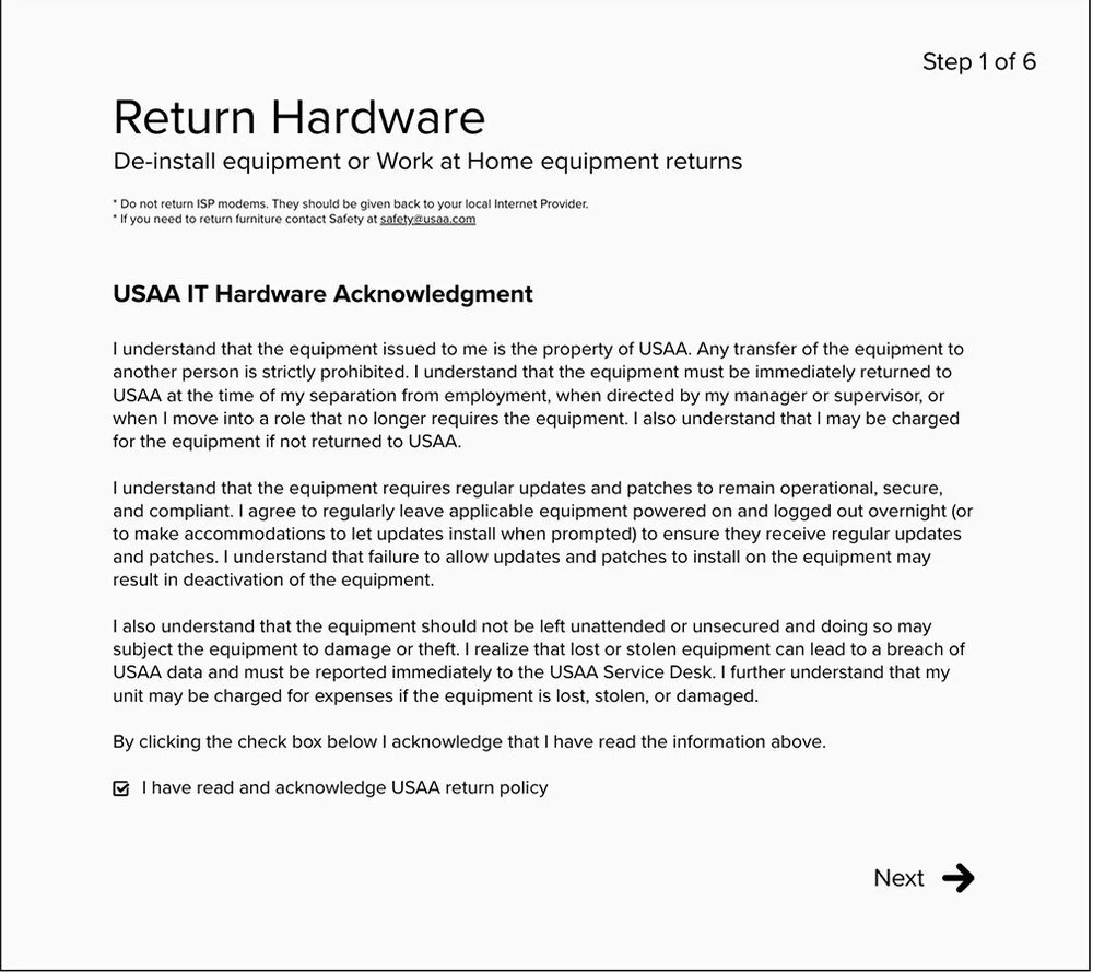
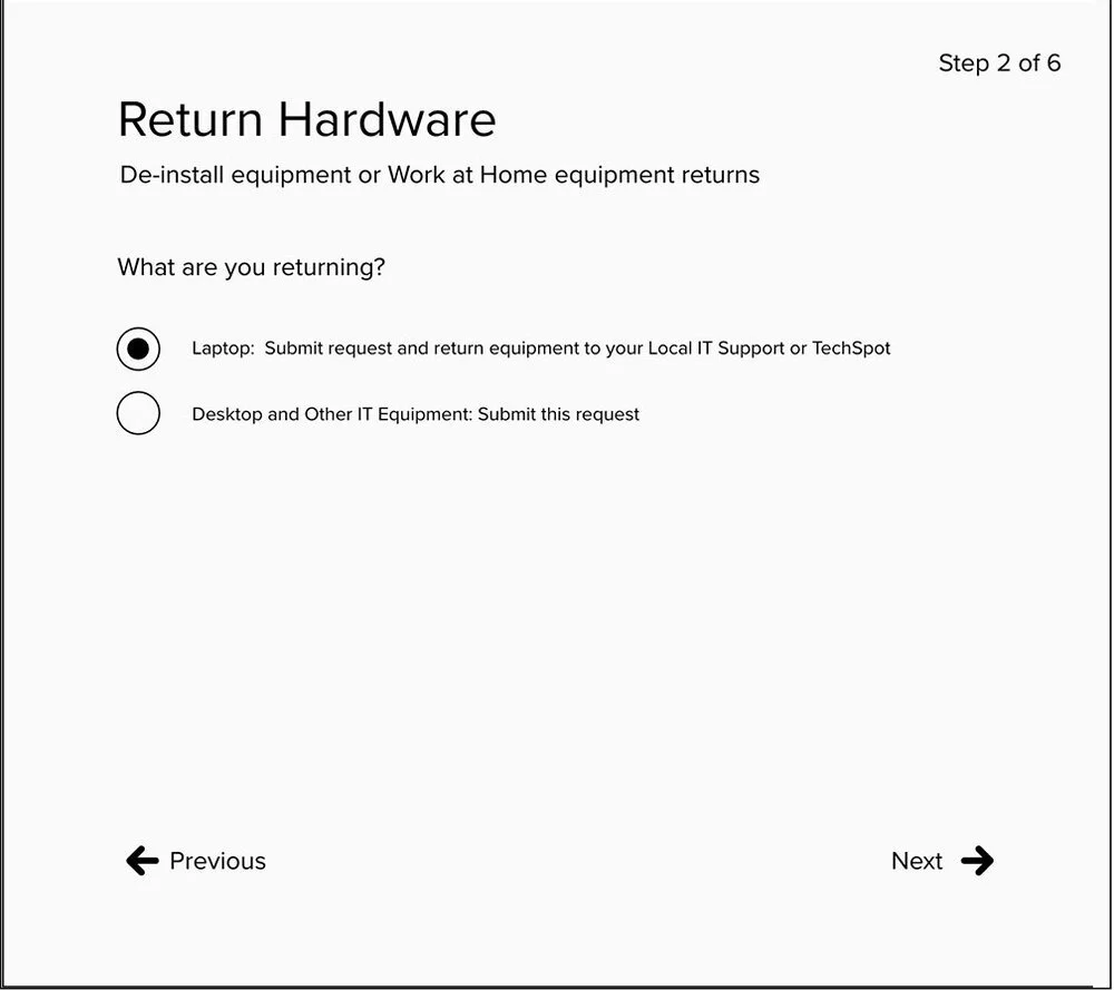
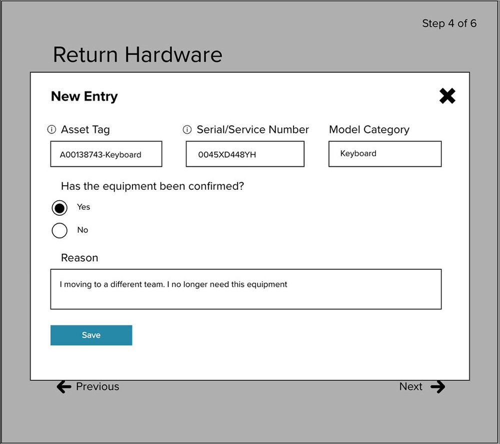
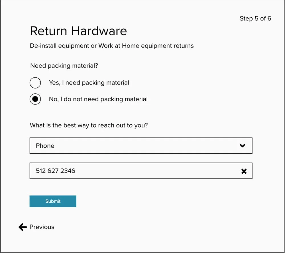
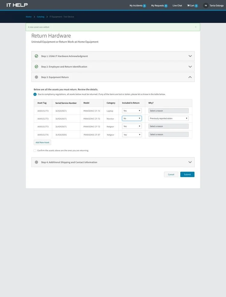
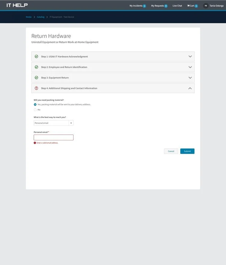
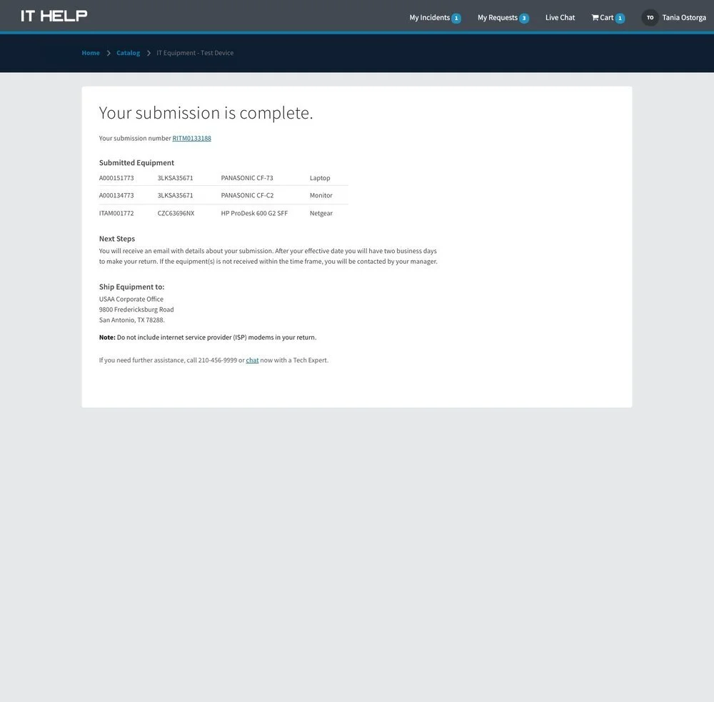
Initial testing for new hardware return form. Used wireframes to test the end-to-end acknowledgment and submission process.
TESTING RESULTS
Tested Acknowledgment and hardware return pages with 4 different users.
Highlights, key takeaways:
The user didn't have an issue reading the Acknowledgment content
Users felt labels were inconsistent
Fewer steps make the process easier
Important instructions on the submission page were overlooked
